


#D8F275

#F7F7F5

#000000

#548EFA

#FFC875
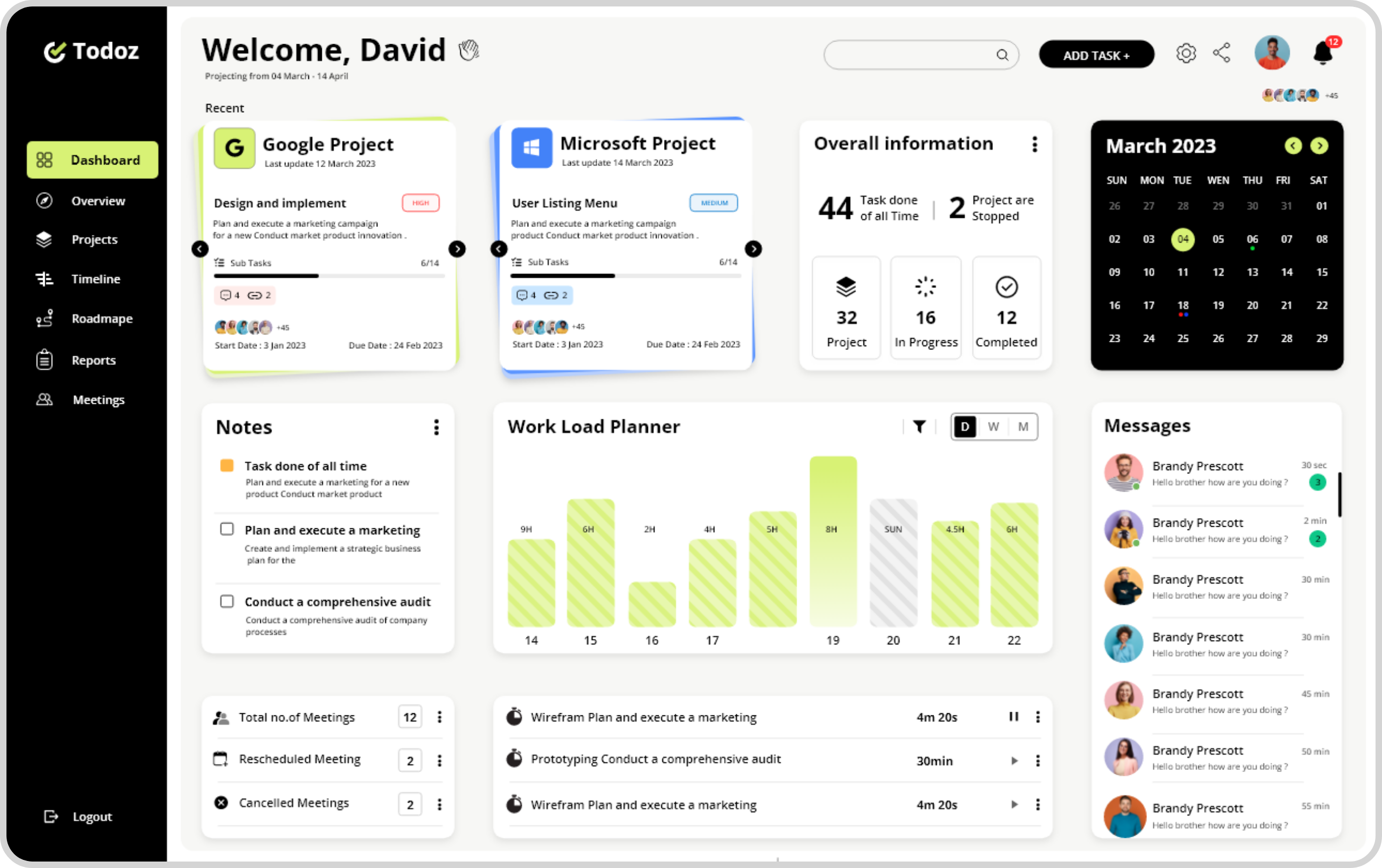

Overview
The Overview page provides a streamlined view of client tasks, making complex data easy to understand at a glance. Users can select the client they’re working with, such as Google, and view a table of tasks. Each row displays key information like task status (color-coded for clarity), start date, due date, progress bar, and assigned team member. The design ensures quick navigation, with minimal effort required to interpret data. Color-coded status (green for completed, blue for in process, yellow for review, and orange for not started) makes it visually intuitive. Task assignments are displayed alongside small profiles, while progress bars show task completion percentages, allowing users to effortlessly track project status.

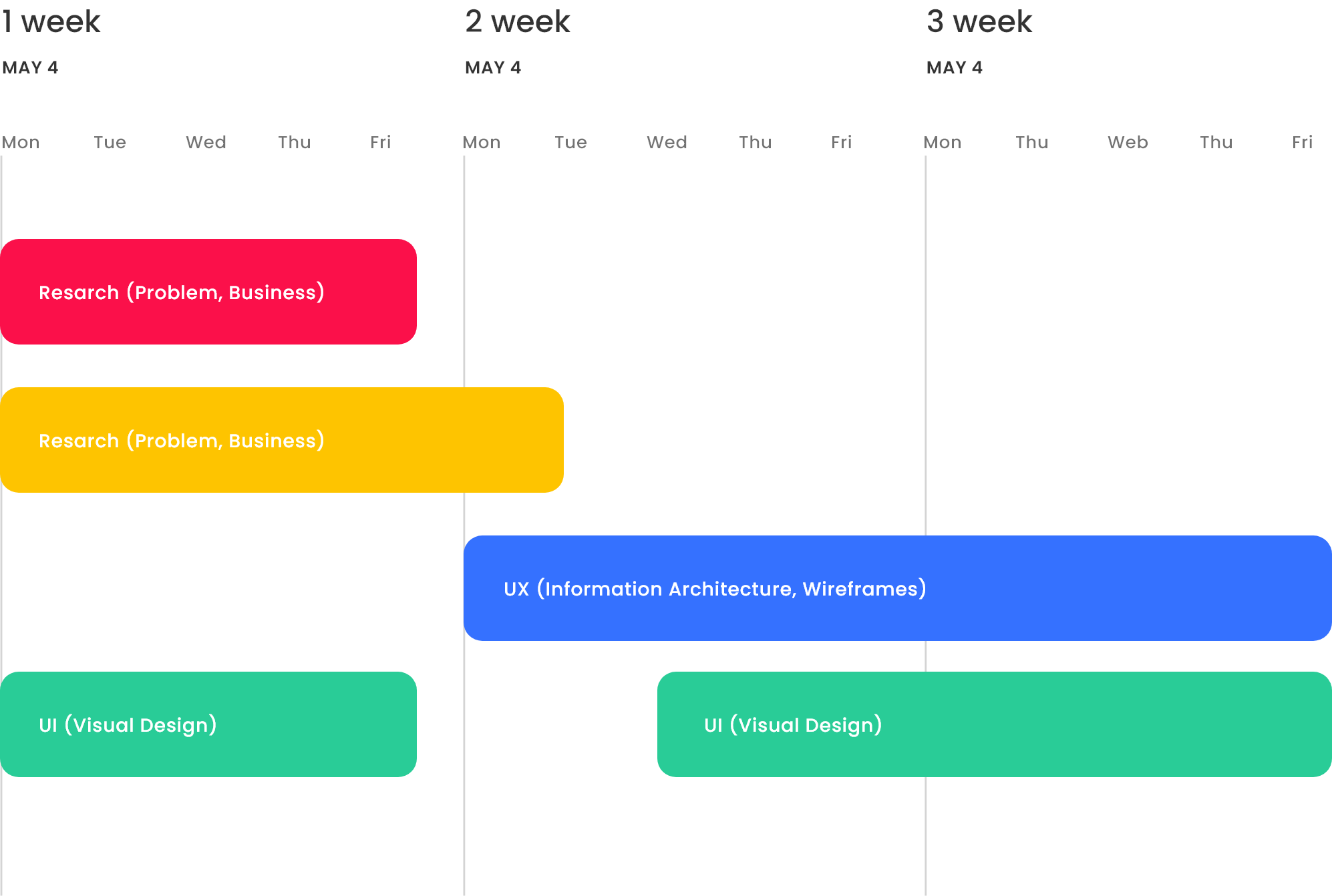
TimeLine
The Timeline page provides a clear, visual representation of project milestones and tasks. Users can select the project they’re working on, and the table displays milestones with start and end dates, duration, and completion progress via a color-coded bar. Tasks are displayed in rows with each day represented in columns. A color-coded bar spans across dates to indicate the task’s duration. Current progress is highlighted, with today’s date marked in yellow for easy reference. The design prioritizes easy comprehension through simple typography, opacity, and visual cues, making it effortless for users to understand task timelines and progress at a glance.

Meetings
The Meeting page organizes meetings by date and time in a clear table format. Each row shows the time of day (e.g., 10 AM, 1 PM, 6 PM) while columns represent dates. Meetings are visualized with color-coded bars indicating their duration, importance, and associated tasks. These bars allow users to easily see meeting details at a glance. The current time is tracked with a vertical line moving through the rows, highlighting where users are in the day’s schedule. The design also supports easy editing by clicking on meeting links and offers viewing options by day, week, or month for better planning.

Visual Solution
The Roadmap page serves as an interactive planning canvas, allowing users to map out tasks visually. Users can create and edit boxes, each representing a task, with options to customize colors, typography, and alignment. The roadmap features tools like zoom, pen, undo, and crop for flexibility. Tasks can be linked with strings to show connections, helping users visualize workflows. Each box can be assigned a name, description, and team members, making it easy to communicate and track progress. This design fosters collaboration and clarity, simplifying the task planning process.

Dark Moad


Rohit Alawe
Freelance Product Designer